Proportional typewriter font modeled on IBM Executive
F25 Executive by Volker Busse of F25 Digital Typeface Design revives the IBM Executive typewriter for document and design use. The font reproduces the original letterforms with a proportional spacing approach and clean slab-serif shapes, supplied in TTF and OTF formats for wide application support. It targets designers, writers, and mid-century aesthetics enthusiasts who want authentic typewriter tone without distressed textures.
What historical accuracy does the font offer?
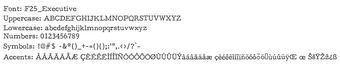
The font is a deliberate revival of the IBM Executive typewriter, modeled to match its mechanical character set rather than the distressed aesthetics common among typewriter-inspired faces. That historical accuracy shows in the proportional approach to character widths modeled on the original machine, making the face suitable for projects that require a period-correct tone without simulated ink marks.
How much typographic flexibility does the font give designers?
Designers gain a clean slab-serif face that supports both body copy and display headers, but the set focuses on standard Latin characters rather than extended typographic features. Because it is proportional rather than monospaced, the font does not produce the fixed-column alignment of traditional typewriter output, which affects layout choices where rigid column alignment is needed.
Is the font easy to install and widely usable across applications?
The font ships in TTF and OTF files, so installation follows the familiar right-click, Install process on desktop systems. It is compatible with mainstream desktop applications such as Microsoft Word and Adobe Creative Cloud and can be activated in most text editors. Users should note that extended multilingual glyph coverage may vary by release and the license bundled with the download governs commercial use.
A measured, historically focused choice for design projects
Executive is a measured choice for designers and writers who want historically minded typewriter typography without distressed effects. Users who need consistent, legible period typography benefit from its targeted design. Check the font's glyph coverage and license terms before deploying it across multilingual projects or commercial work; that consideration determines whether it fits broader publishing needs or remains best suited to English-language layouts.
Pros
Proportional spacing replicates the IBM Executive mechanical metrics
Clean slab-serif letterforms improve legibility for body and display text
Supplied as TTF and OTF for broad application compatibility
Modeled specifically to avoid distressed textures common in typewriter fonts
Cons
Limited extended multilingual glyph coverage in some releases
Not monospaced, so typewriter column alignment cannot be reproduced
Commercial use may require checking the bundled license
Laws concerning the use of this software vary from country to country. We do not encourage or condone the use of this program if it is in violation of these laws. Softonic may receive a referral fee if you click or buy any of the products featured here.